Button
How To Use A Button Widget Of UBE Addons
Create an eye-catchy call to actions using Button Widget with lots of customization options and hover effects. In addition, you will have the ability to add an icon to it by choosing from a list of Font Awesome icons.
Using Button:
You can see the below video to get an insight into how you can use the Button Widget to create beautiful designs. Or you can follow the documentation whichever you find convenient.
How to Activate Button
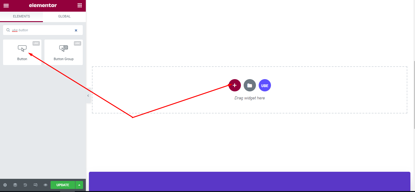
To use this UBE Addons element, find the ‘ube button‘ element from the Search option under the ‘ELEMENTS‘ tab. Simply just Drag & Drop the ‘Button‘ into the ‘Drag widget here‘ or the ‘+’ section.
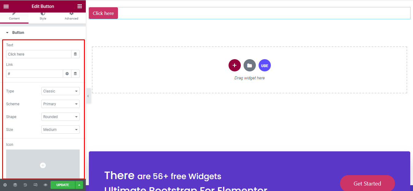
How to Configure Content Settings
Under the ‘Content’ tab, you will find the Button sections.
| Text | Enter text for the button |
|---|---|
| Link | Enter the link for the button |
| Type | Choose the type of the button, taken from the type of bootstrap |
| Scheme | Choose button color, including bootstrap base colors |
| Shape | Choose the shape of the buttons |
| Size | Choose the size of the buttons |
| Icon | Choose icon of button |
| Button ID | Enter the ID of the button |
| onclick Event | Is it possible to add javascript events for the button? If yes, it will allow you to enter Javascript code |
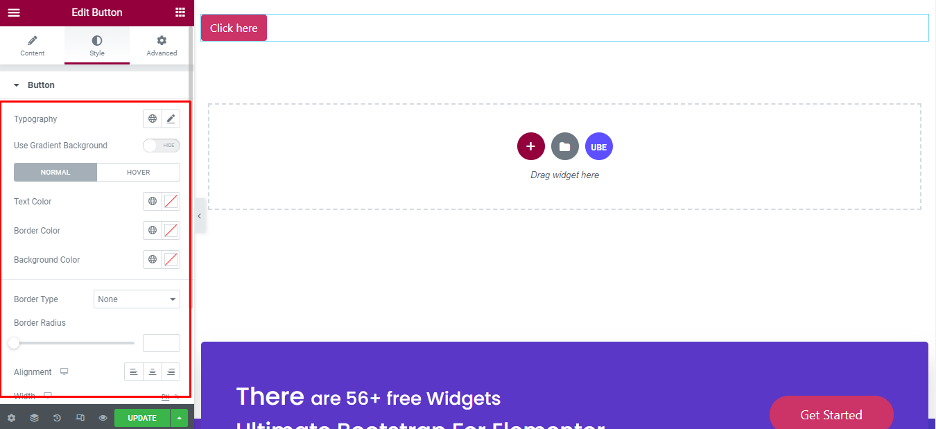
How to Style Button
Switch to the ‘Style’ tab to style all the elements of Button.
‘Button’ section lets you add Typography; Text Color, Border Color, Background Color in normal and hover mode; Border Type, Border Radius, Alignment, Width, Box Shadow, Padding to the Button.
Final Outcome
By following these mentioned steps and a bit more modifying & styling, you can easily design your Button as per your preference.
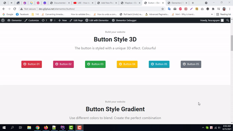
By using UBE Button, this is how you can easily put the spotlight on your significant contents & make them appealing to your visitors.
Getting stuck? Feel to Contact Our Support for further assistance.