Contact Form 7
How To Use A Contact Form 7 Widget Of UBE Addons
Contact Form 7 Widget of UBE Addons gives you the opportunity to personalize your Contact Form 7 forms as per your liking. Thanks to this element, you are able to create amazing layout for the Contact Form 7 and get your visitors easily hooked up.
Using Contact Form 7:
You can see the below video to get an insight into how you can use the Contact Form 7 Widget to create beautiful designs. Or you can follow the documentation whichever you find convenient.
How to Activate Contact Form 7
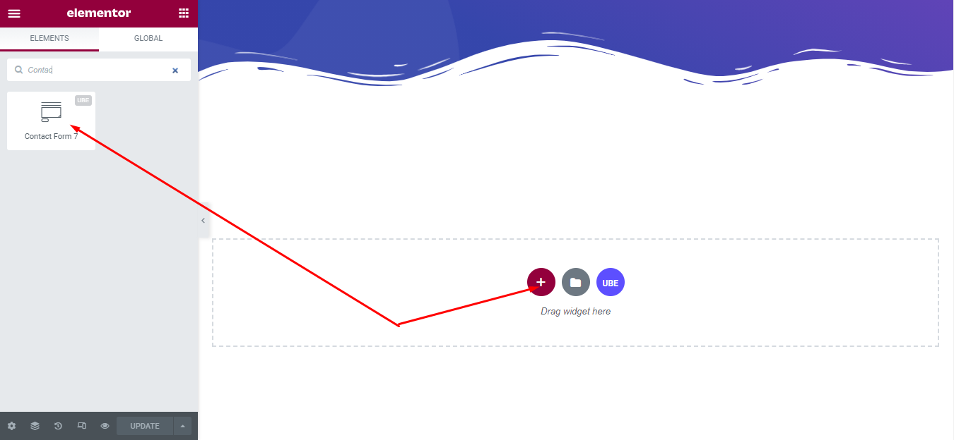
To use this UBE Addons element, find the ‘Contact Form 7‘ element from the Search option under the ‘ELEMENTS‘ tab. Simply just Drag & Drop the ‘Contact Form 7‘ into the ‘Drag widget here‘ or the ‘+’ section.
How to Configure Content Settings
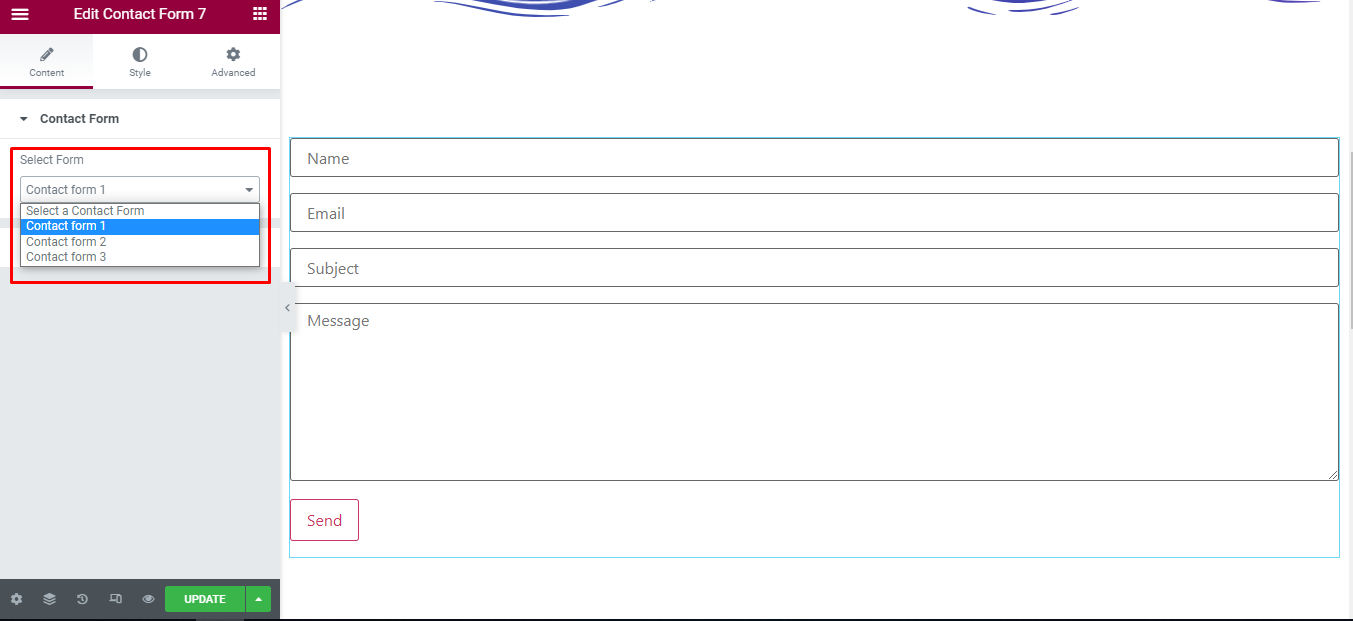
Under the ‘Content’ tab, you will find the Contact Form sections.
Contact Form
– Select Form: select the pre-created contact form in the backend of contact form 7.
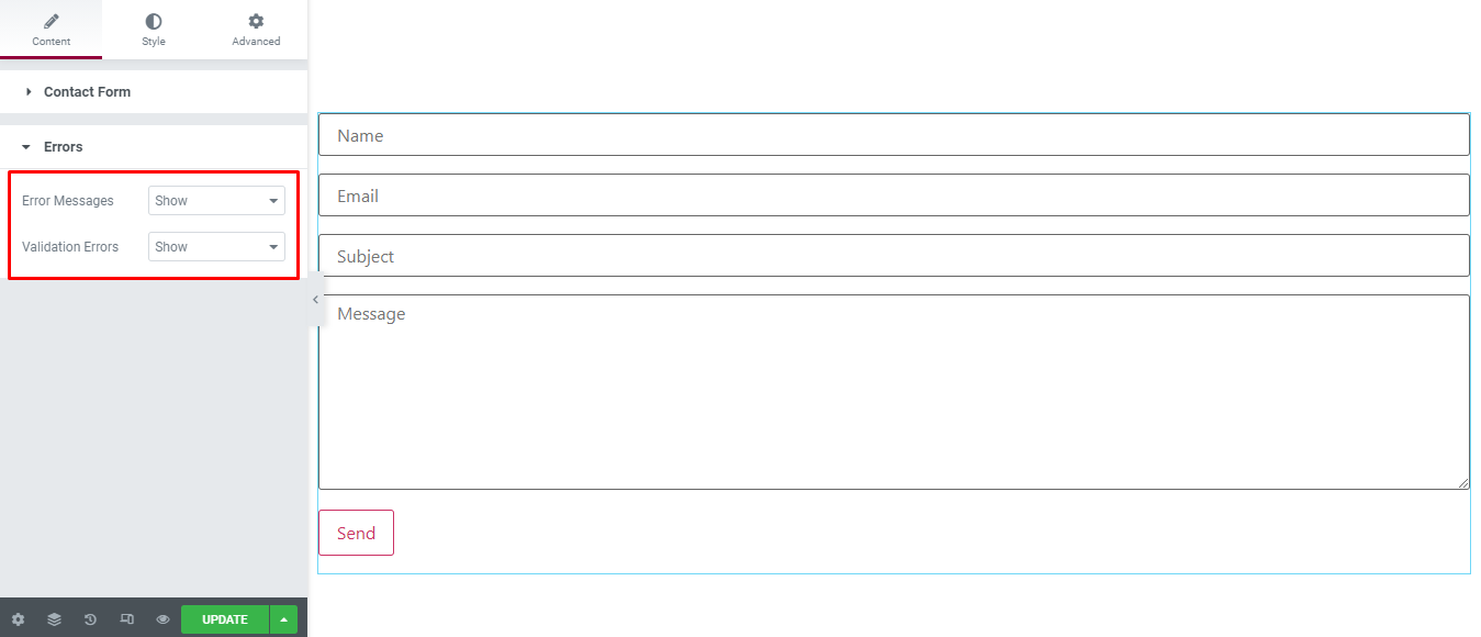
Errors
| Error Messages | Whether to allow the display of a message when there is an error in submitting the form or not |
|---|---|
| Validation Errors | Is it possible to display error messages when validating data |
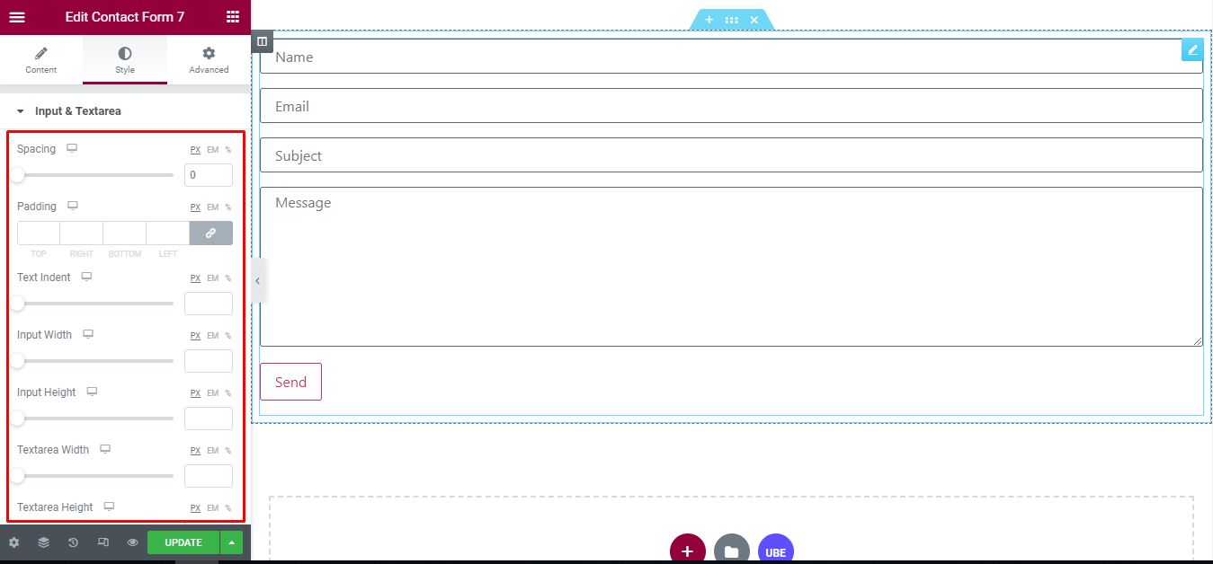
How to Style Contact Form 7
Switch to the ‘Style’ tab to style all the elements of Contact Form.
Input & Textarea
‘Input & Textarea’ section lets you add ‘Spacing’, ‘Padding’, ‘Text Indent’, ‘Input Width’, ‘Input Height’, ‘Textarea Width’, ‘Textarea Height’, ‘’, ‘Typography’, ‘Background’, ‘Border Type’, ‘Box Shadow’ of normal and hover mode to the input and textarea of contact form.
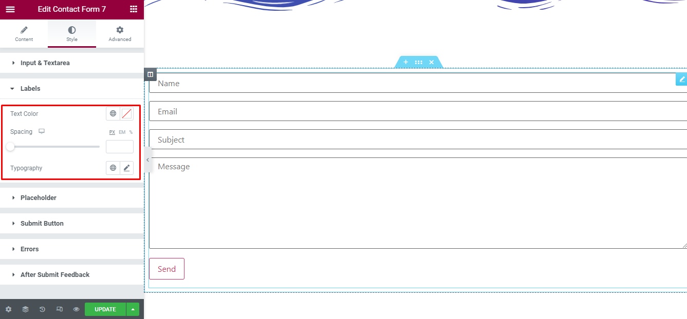
Labels
‘Labels’ section lets you add ‘Spacing’, ‘Text Color’, ‘Typography’ to the labels of contact form.
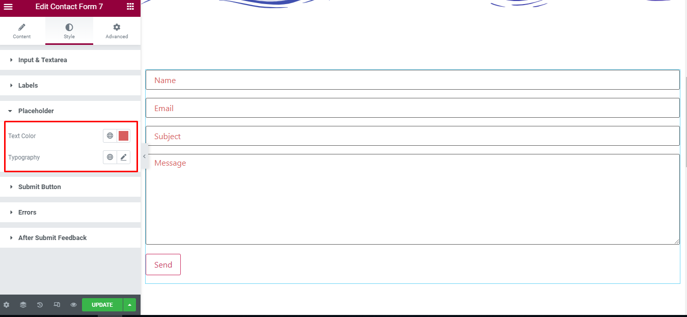
Placeholder
‘Placeholder’ section lets you add ‘Text Color’, ‘Typography’ to the placeholder of input.
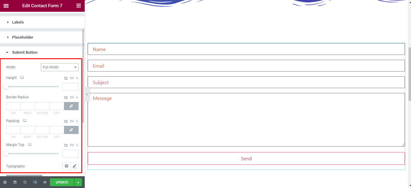
Submit Button
‘Submit Button’ section lets you add ‘Alignment’, ‘Width’, ‘Height’, ‘’, ‘Padding’, ‘Margin Top’, ‘Typography’, ‘Background Color’, ‘Text Color’, ‘Border Type’, ‘Box Shadow’ of normal and hover mode to the submit button of contact form.
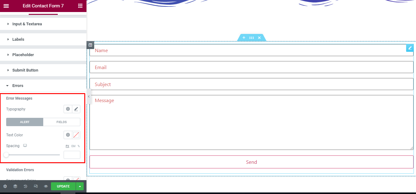
Errors
Error Messages
‘Error Messages’ section lets you add ‘Spacing’, ‘Text Color’ , ‘Typography’, ‘Background Color’ of normal and hover mode to the Errors messages of contact form.
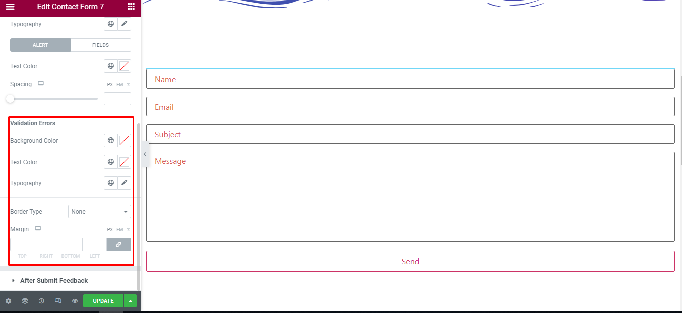
Validation Errors
‘Validation Errors’ section lets you add ‘Text Color’ , ‘Typography’, ‘Background Color’, ‘Border Type’, ‘Margin’ to the Validation Errors of contact form.
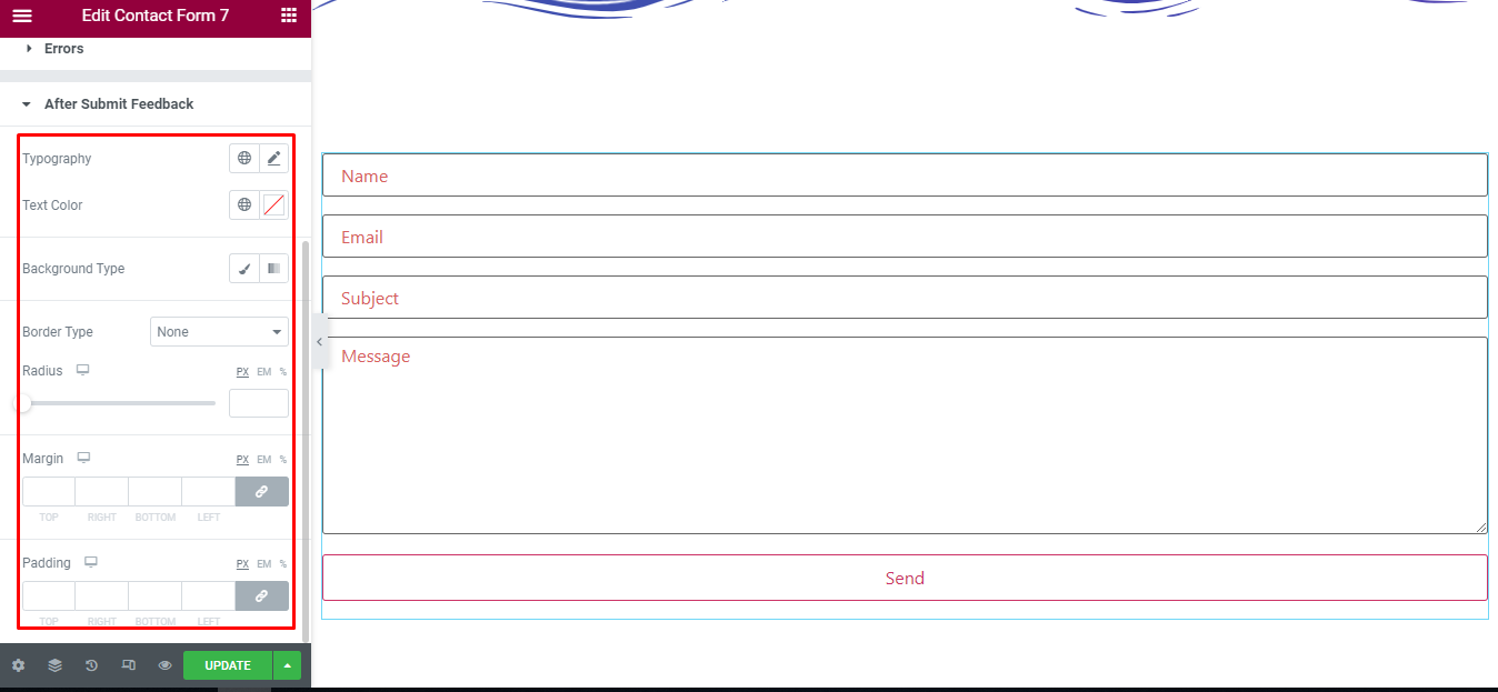
After Submit Feedback
‘After Submit Feedback’ section lets you add ‘Text Color’ , ‘Typography’, ‘Background Type’, ‘Border Type’, ‘Radius’, ‘Margin’, ‘Padding’ to the message of form after submit success of contact form.
Final Outcome
By following these mentioned steps and a bit more modifying & styling, you can easily design your Contact Form 7 as per your preference.
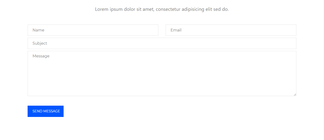
By using UBE Contact Form 7, this is how you can easily put the spotlight on your significant contents & make them appealing to your visitors.
Getting stuck? Feel to Contact Our Support for further assistance.