Post Slider
How to Configure and Style UBE Post Slider
UBE Post Slider places multiple post/blogs in an aesthetic post carousel. The purpose of this element is to let you organize and place your posts in one place. With the help of it, you can nicely display the listing of your blog posts.
Using Post Slider:
You can see the below video to get an insight into how you can use the Post Slider Widget to create beautiful designs. Or you can follow the documentation whichever you find convenient.
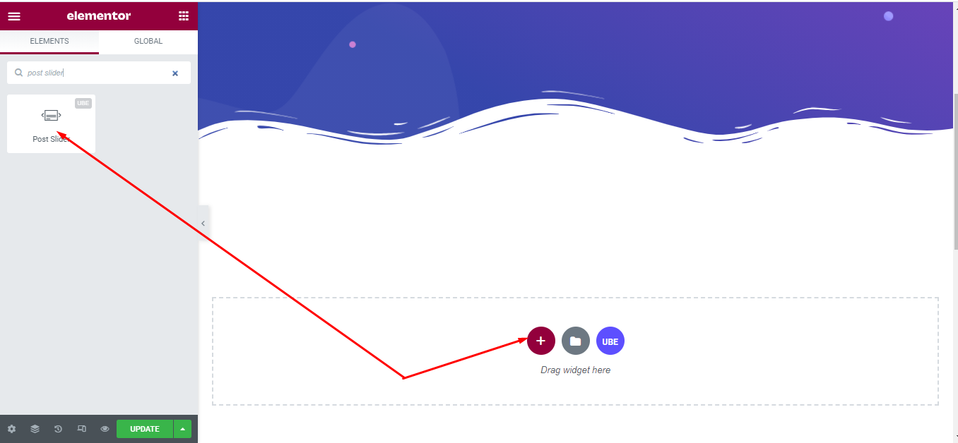
How to Activate Post Slider
To use this UBE Addons element, find the ‘Post Slider‘ element from the Search option under the ‘ELEMENTS‘ tab. Simply just Drag & Drop the ‘Post Slider‘ into the ‘Drag widget here‘ or the ‘+’ section.
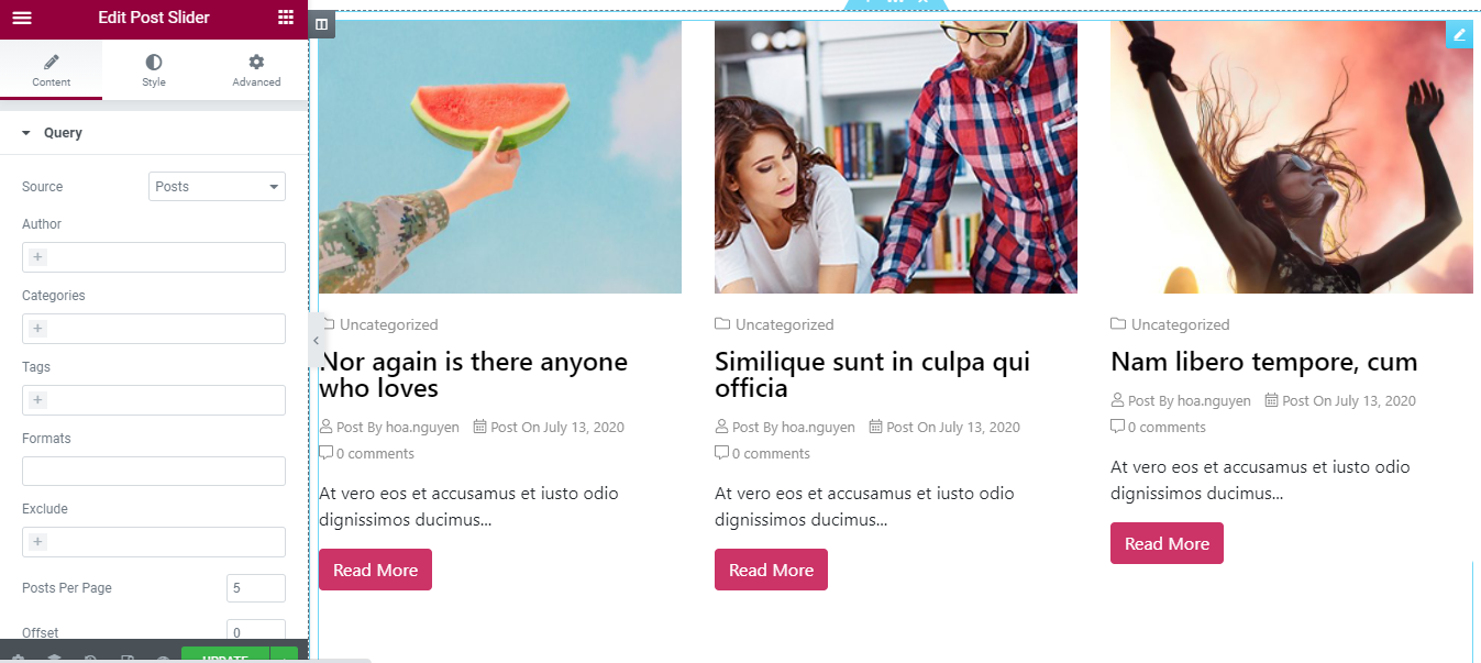
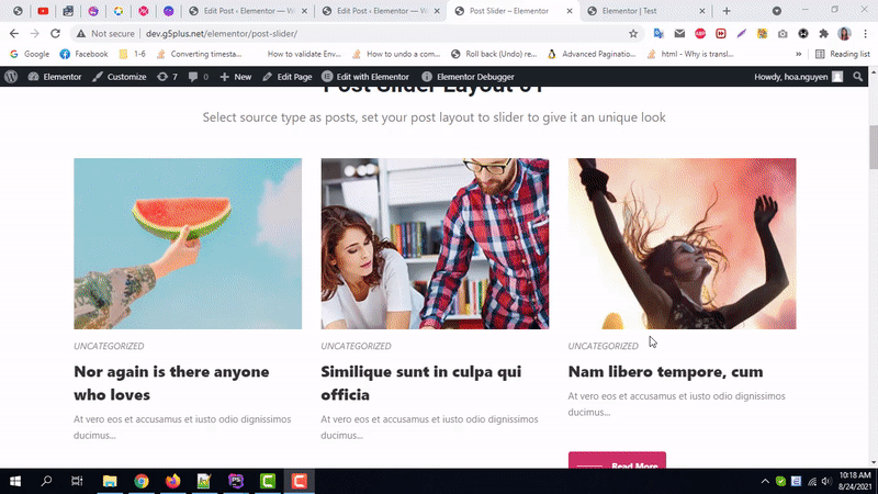
After you are done with Step 1, this is the basic layout you are going to view:
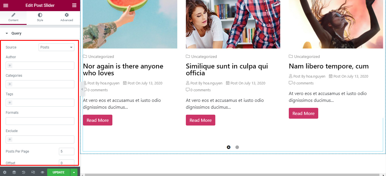
How to Configure Content Settings
Under the ‘Content’ tab, you will find the Post Slider sections.
Query.
| Source | Choose includes Posts – get any post and Manual Selection – get the post selected by title |
|---|---|
| Author | Limit getting post by certain author, if not selected, default will get post of all author |
| Categories | Limit getting post to certain categories. If not selected, the default will get all posts of all existing categories. |
| Tags | Limit getting post by some tags, if not selected, the default will get post of all tags |
| Formats | Limit getting post according to the format of the post |
| Exclude | Getting post does not include the posts contained in this control |
| Offset | Enter number will start getting post from post number in the list |
| Order By | Choose the field to sort posts |
| Order | Choose ascending or descending sort order |
Layout Settings
| Post Layout | Select the layout of the post you want to display |
|---|---|
| Show Filter Category | Allow filtering by category or not. If so, will display the entire category for filtering |
| Show Image | Allow to display the image of the post |
| Size Mode | Choose the ratio of the image |
| Show Title | Whether to display the title of the post or not |
| Show excerpt | Whether to display the post’s excerpt |
| Excerpt Words | Enter number word of excerpt. This control is only visible when Show Excerpt is enabled. |
| Expansion Indicator | Enter symbol after excerpt |
| Show Read More Button | Whether to display read more button or not |
| Button Text | Enter the text of the button read more. This control is displayed only when the Show Read More Button is enabled. |
| Suffix Icon | Enter icon of the read more button after the text |
| Show Read More Button Prefix Style | Whether to show Read More Button Prefix Style |
| Show Meta | Allow to display the post’s meta or not |

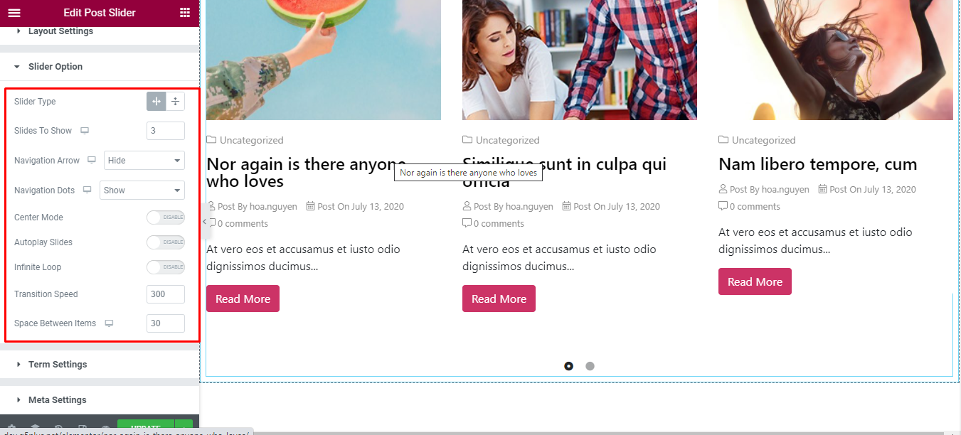
Slider Options
| Slider Type | Choose whether the slider is horizontal or vertical |
|---|---|
| Slides To Show | Choose the number of slides to display on 1 page. You can choose the number of slides corresponding to each responsive screen |
| Navigation Arrow | Allows arrow navigation or not? Allow showing and hiding in each responsive screen |
| Navigation Dots | Allows to display the navigation style dots or not. Similar to arrows, allows display in each screen responsive |
| Center Mode | Allow center mode or not |
| Autoplay Slides | Allow autoplay or not |
| Autoplay Speed | Speed of autoplay mode, this is only displayed in case Autoplay Slides is enabled |
| Infinite Loop | Whether to allow unlimited loops or not |
| Transition Speed | The speed of the transition moving between slides |
| Space Between Items | The distance between slides |
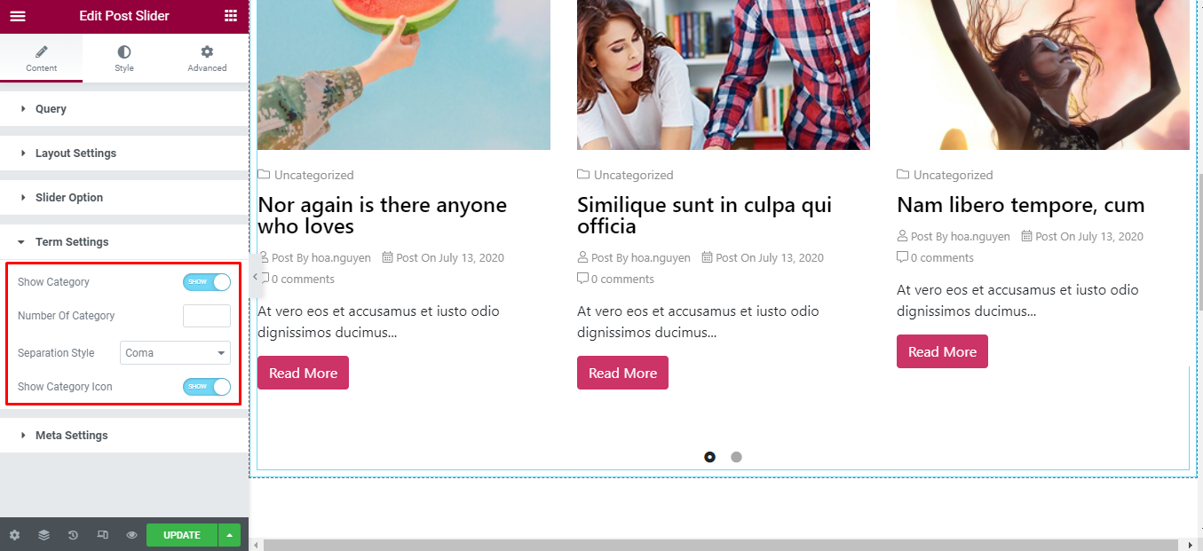
Term Settings
| Show Category | Allow to display category or not |
|---|---|
| Number Of Category | Enter the number of categories displayed. If not entered, all will be displayed. |
| Separation Style | Choose the type of separation between categories |
| Show Category Icon | Enable show category icon or not |
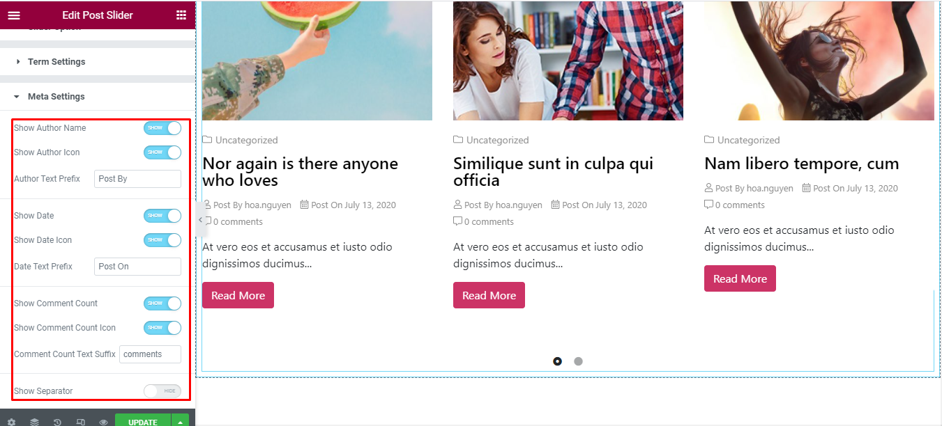
Meta Settings
| Show Author Name | Allows displaying the author’s name or not |
|---|---|
| Show Author Icon | Allows displaying the author’s avatar, this control is only displayed when Show Author Icon is turned off. |
| Show Avatar | Limit getting post to certain categories. If not selected, the default will get all posts of all existing categories. |
| Author Text Prefix | Enter text displayed before the author’s name |
| Formats | Limit getting post according to the format of the post |
| Exclude | Getting post does not include the posts contained in this control |
| Offset | Enter number will start getting post from post number in the list |
| Order By | Choose the field to sort posts |
| Order | Choose ascending or descending sort order |
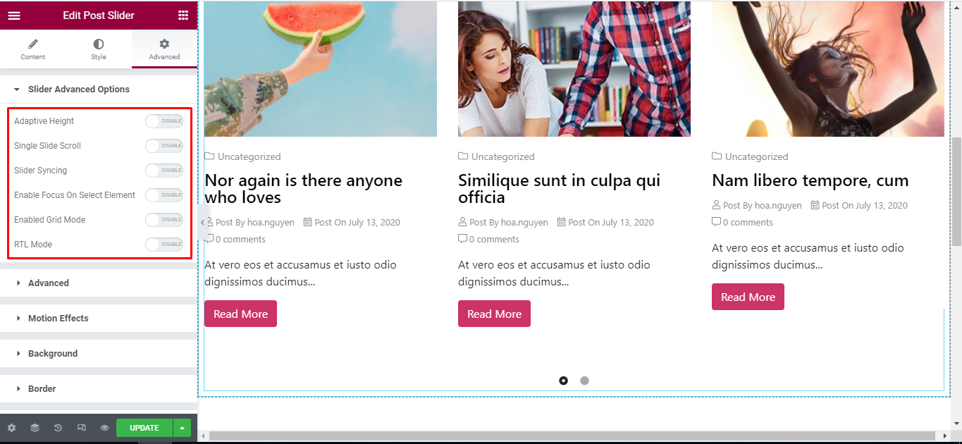
Advanced
Under the ‘Advanced’ tab, you will find the Slider Advanced Options sections.
| Adaptive Height | Allows Adaptive Height mode. If it is enabled, the slider will calculate its height according to the content of the largest height slide |
|---|---|
| Pause Autoplay On Hover | Is it possible to stop autoplay when hovering on the slider? This is displayed only when Autoplay Slides mode is enabled. |
| Slider Syncing | Allows slider to sync with other slider or not |
| ID or Class Of Slider To Syncing | Id or class of the slider you want to sync with the current slider. This is displayed only when Slider Syncing is enabled |
| Enable Focus On Select Element | Whether to enable Enable Focus On Select Element mode or not |
| Enabled Grid Mode | Whether to enable grid mode or not |
| Slide Rows | Enter number of row of a slider page |
| Slides Per Row | Enter number of sliders per row. These two controls are displayed only when Enabled Grid Mode is enabled |
| Infinite Loop | Whether to allow unlimited loops or not |
| RTL Mode | Is RTL mode allowed |
How to Style Post Slider
Switch to the ‘Style’ tab to style all the elements of Post Slider.
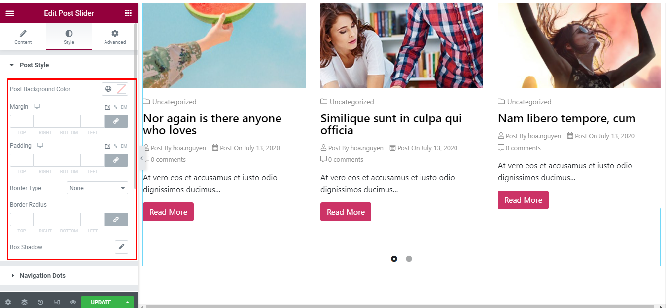
Post Style
‘Post Style’ section lets you add Post Background Color, Padding, Margin, Border Radius, Border Type, Box Shadow to the Post.
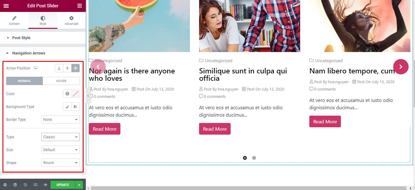
Navigation Arrows
‘Navigation Arrows’ section lets you choose Arrow Position, Color, Background, Border in Normal and Hover. It allow you change type of arrow is classic or outline, size of arrows.
Navigation Dots
‘Navigation Dots’ section lets you choose Dots Position, Color, Size.

Content Style
‘Content Style’ section lets you add Text Align, Content Padding, Content Margin, Content Width, Background Type to the content of Post.

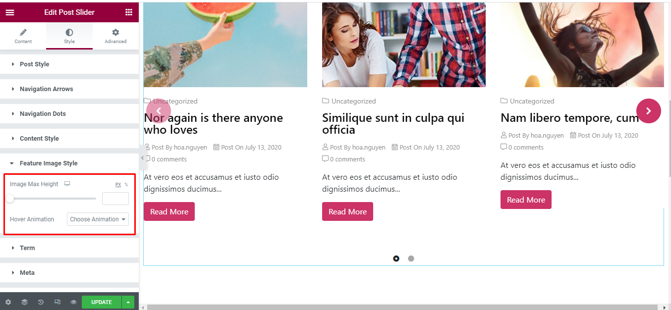
Feature Image Style
‘Feature Image Style’ section lets you add Image Max Height, Hover Animation to the feature image of Post.
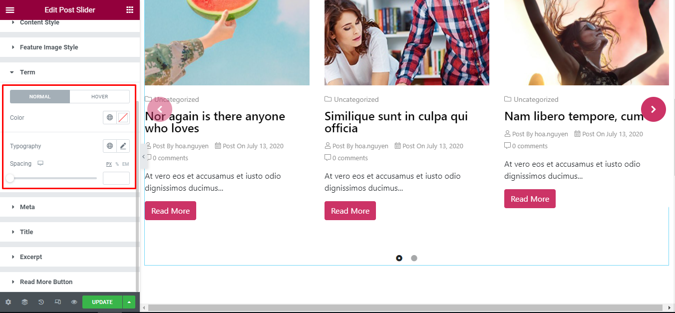
Term
‘Term’ section lets you add Color in normal and hover mode, Typography, Spacing to the Terms of Post.
Meta
‘Meta’ section lets you add Color, Author Name Color, Date Color, Comment Color in normal and hover mode, Icon Color, Typography, Spacing, Item Spacing, Author Image Width, Author Image Height, Author Image Border Radius, Author Image Spacing to the Meta of Post.

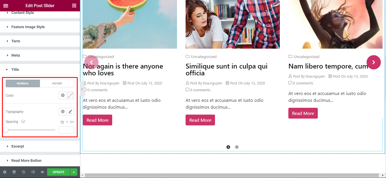
Title
‘Title’ section lets you add Color in normal and hover mode, Typography, Spacing to the Title of Post.
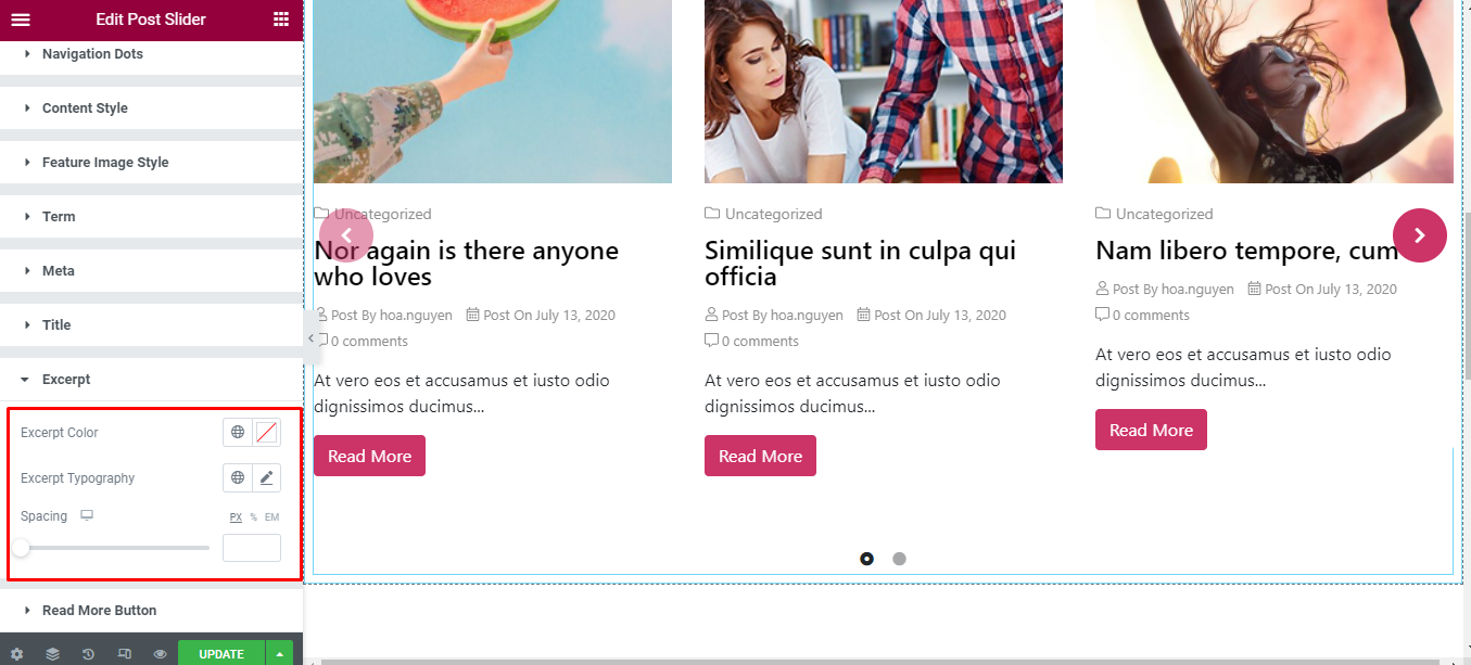
Excerpt
‘Excerpt’ section lets you add Excerpt Color , Excerpt Typography, Spacing to the Excerpt of Post.
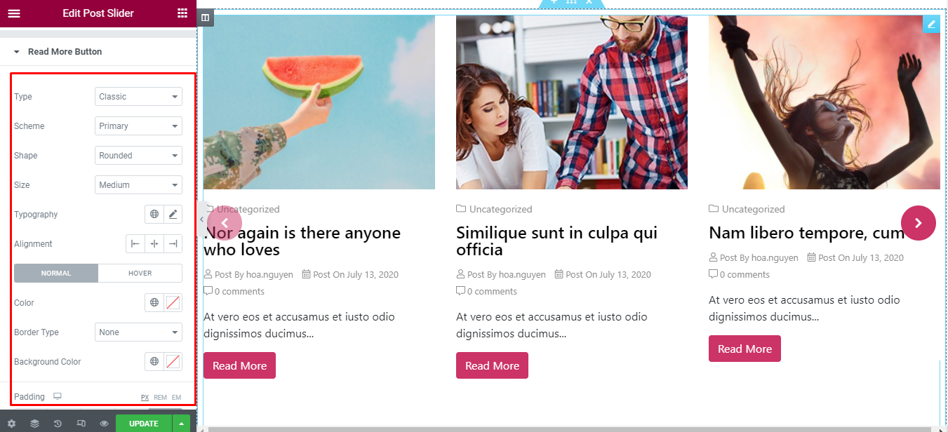
Read More Button
‘Read More Button’ section lets you add Type, Scheme, Shape, Size, Typography, Alignment and Color, Border Type, Background Color in normal and hover mode to the Meta of Post. Moreover, you have the freedom to change Padding & Border Radius.
Final Outcome
By following these mentioned steps and a bit more modifying & styling, you can easily design your Post Slider as per your preference.
By using UBE Post Slider, this is how you can easily put the spotlight on your significant contents & make them appealing to your visitors.
Getting stuck? Feel to Contact Our Support for further assistance.