Advanced Accordion
How to Configure and Style UBE Advanced Accordion
Make your important content readable to the user with Advanced Accordion Widget on your pages without scrolling down
Using Advanced Accordion:
You can see the below video to get an insight into how you can use the Advanced Accordion Widget to create beautiful designs. Or you can follow the documentation whichever you find convenient.
How to Activate Advanced Accordion
To use this UBE Addons element, find the ‘Advanced Accordion‘ element from the Search option under the ‘ELEMENTS‘ tab. Simply just Drag & Drop the ‘Advanced Accordion‘ into the ‘Drag widget here‘ or the ‘+’ section.
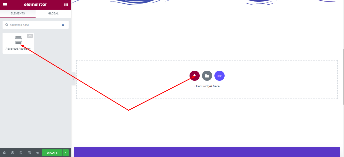
After you are done with Step 1, this is the basic layout you are going to view:
How to Configure Content Settings
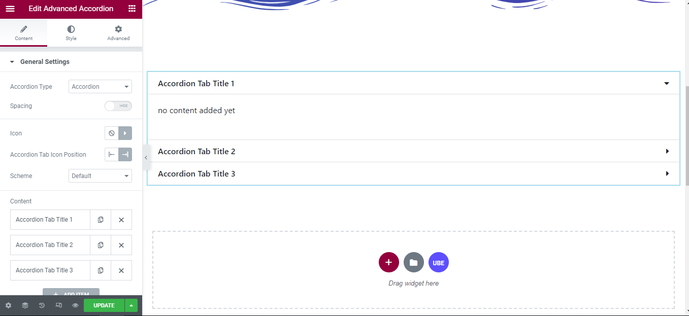
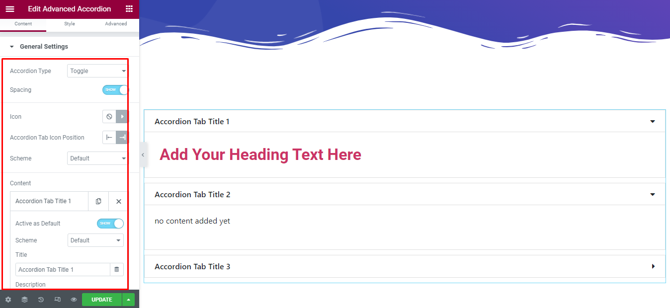
Under the ‘Content’ tab, you will find the General Settings sections.
General Settings
From the ‘General Settings’ section,
| Accordion Type | Choose accordion type, including accordion and toggle |
|---|---|
| Spacing | Allow spacing between item or not |
| Accordion Tab Icon Position | Choose the position of the icon is to the left or right of the accordion item |
| Scheme | Choose the default color for the tab including border, text and background depending on the style of the tab. |
| Icon | Allow displaying icons on tabs or not |
– Content: each item of the accordion includes:
| Active as Default | Whether for active default or not |
|---|---|
| Scheme | Choose background color of the current item |
| Title | Enter the title of the accordion |
| Description | Entered by editing each item, adding the widget you want. |
How to Style Advanced Accordion
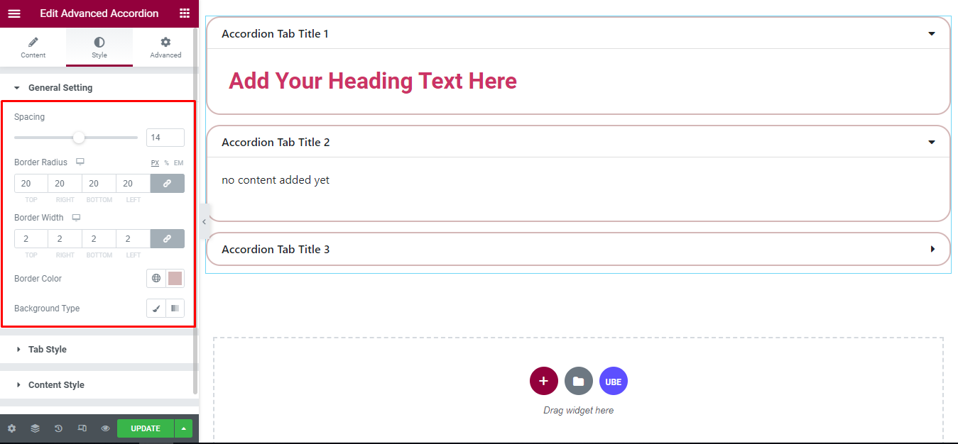
Switch to the ‘Style’ tab to style all the elements of Advanced Accordion.
General Settings
‘General Settings’ section lets you choose Spacing, Border Radius, Border Width, Border Color, Background Type to accordion.
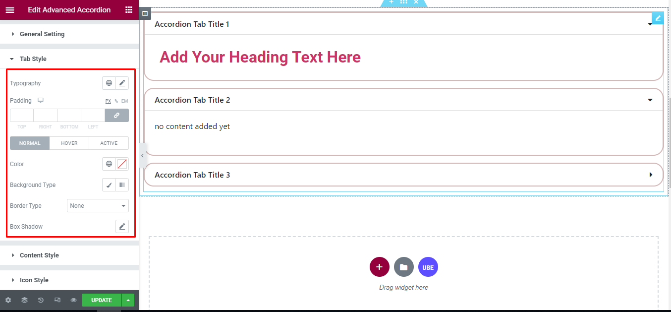
Tab Style
‘Tab Style’ section lets you choose Typography, Padding and Color, Border Type, Background Type, Box Shadow in normal, hover and active mode to the tab of accordion.
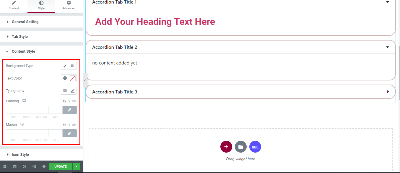
Content Style
‘Content Style’ section lets you choose Background Type, Text Color, Typography, Padding, Margin to the content of accordion.
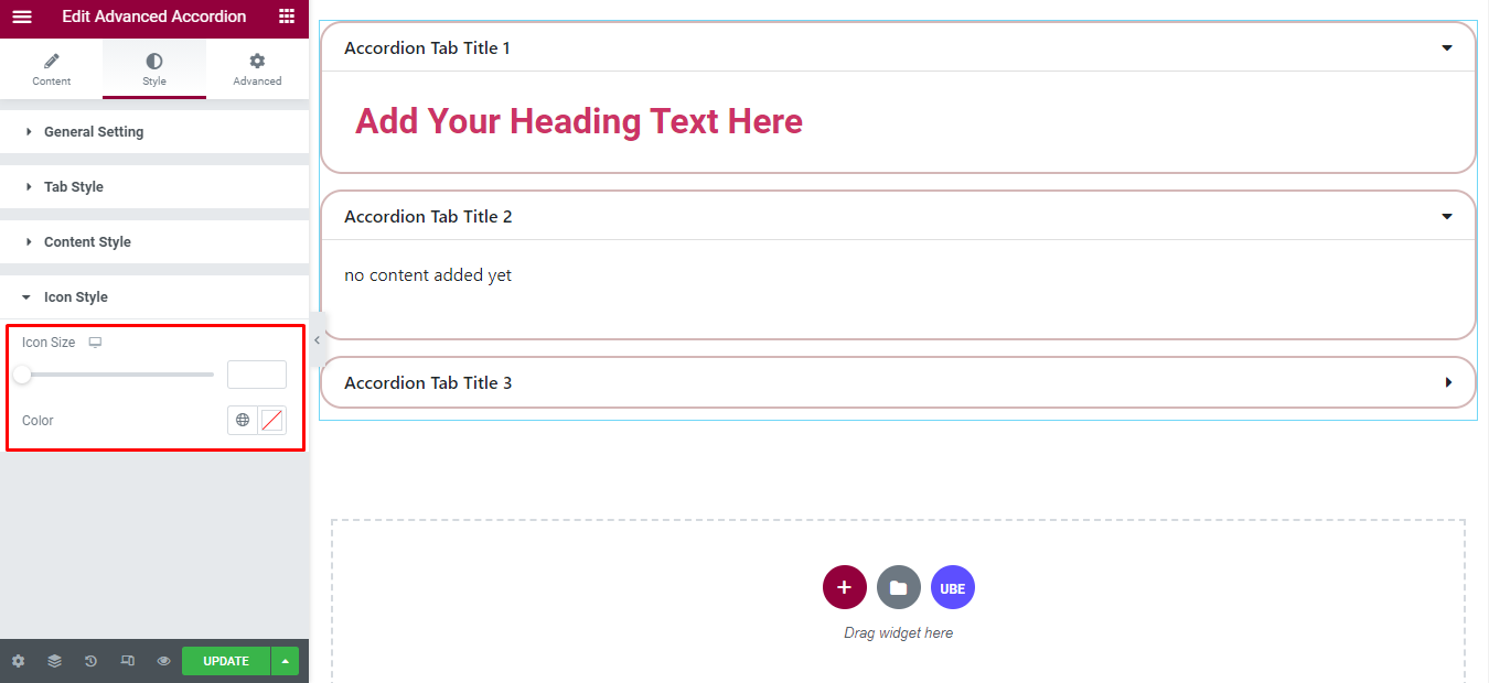
Icon Style
‘Icon Style’ section lets you choose Icon Size, Color to the icon of accordion.
Final Outcome
By following these mentioned steps and a bit more modifying & styling, you can easily design your Advance Accordion as per your preference.
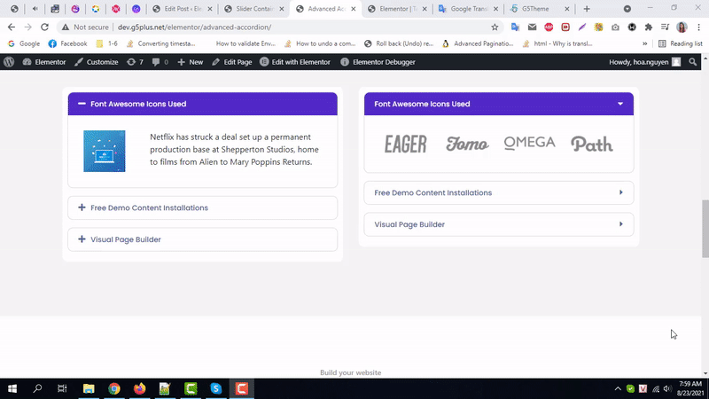
By using UBE Advanced Accordion, this is how you can easily put the spotlight on your significant contents & make them appealing to your visitors.
Getting stuck? Feel to Contact Our Support for further assistance.