Modals
How To Use A Modals Of UBE Addons
Modals lets you easily create popups which open after certain actions are triggered. This means you can display strong messages that will have meaningful impact on your readers. It is an extension to your content area. You can add any content that you want by add elementor template as Form, Map,…
Using Modals:
You can see the below video to get an insight into how you can use the Modals Widget to create beautiful designs. Or you can follow the documentation whichever you find convenient.
How to Activate Modals
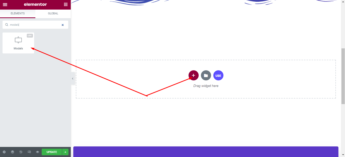
To use this UBE Addons element, find the ‘Modals‘ element from the Search option under the ‘ELEMENTS‘ tab. Simply just Drag & Drop the ‘Modals‘ into the ‘Drag widget here‘ or the ‘+’ section.
How to Configure Content Settings
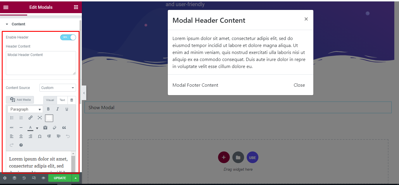
Under the ‘Content’ tab, you will find the Modals sections.
Content
| Enable Header | Whether to display the header of the modal or not |
|---|---|
| Header Content | Enter header content if Enable Header is on |
| Content Source | Choose content source include custom(entered) and elementor template |
| Content | Enter content if Content Source is custom selected |
| Template | Select the elementor template that was created earlier if Content Source is Elementor Template selected. |
| Enable Footer | Whether to display the footer of the modal or not |
| Footer Content | Enter footer content if Enable Footer is on |
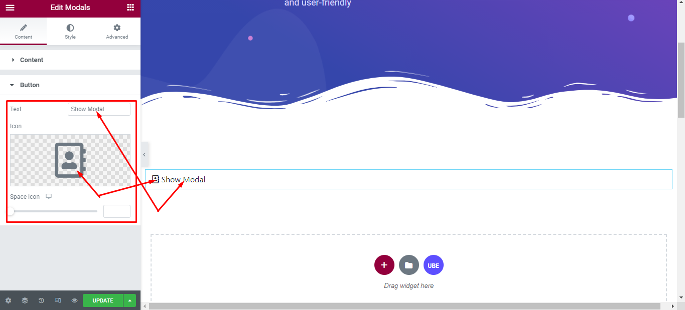
Button
| Text | Enter text for button |
|---|---|
| Icon | Choose icon for button |
| Space Icon | Enter distance from icon and text off button |
How to Style Modals
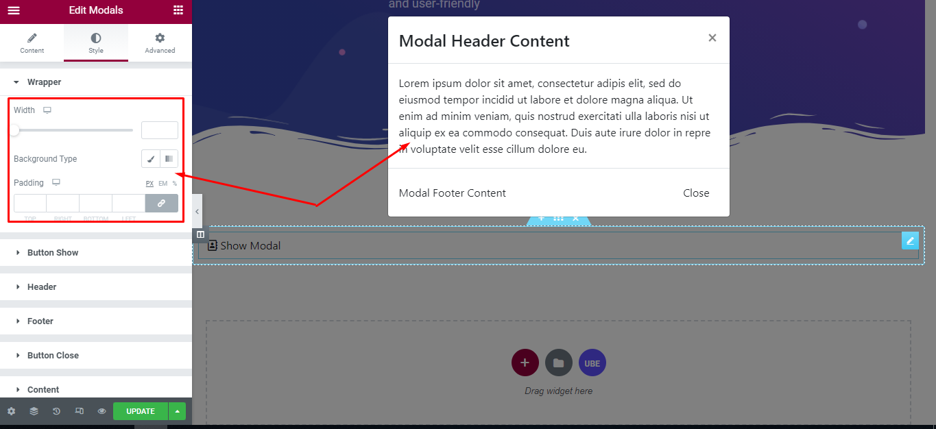
Switch to the ‘Style’ tab to style all the elements of Modals.
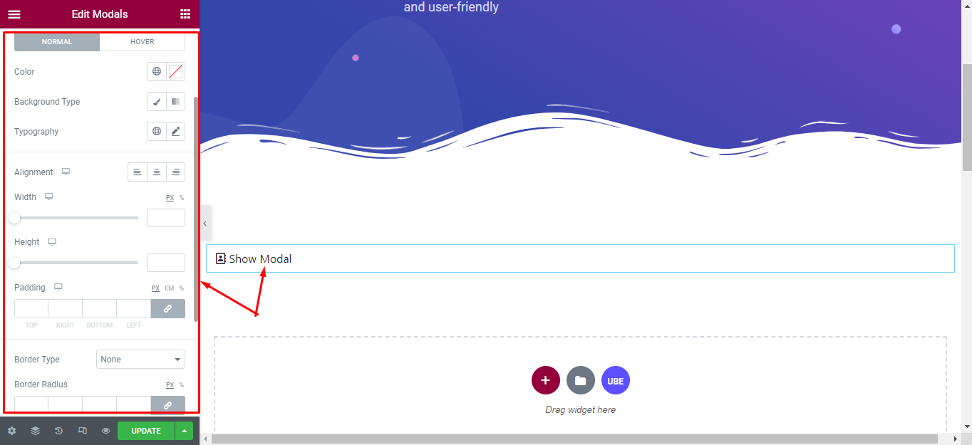
Wrapper
‘Wrapper’ section lets you choose Width, Background Type, Padding to the Modals
Button Show
‘Button Show’ section lets you choose Alignment, Width, Height, Border Type, Padding, Border Radius; Typography, Border Type, Background Type in normal and hover mode to the button trigger show modal of modals.
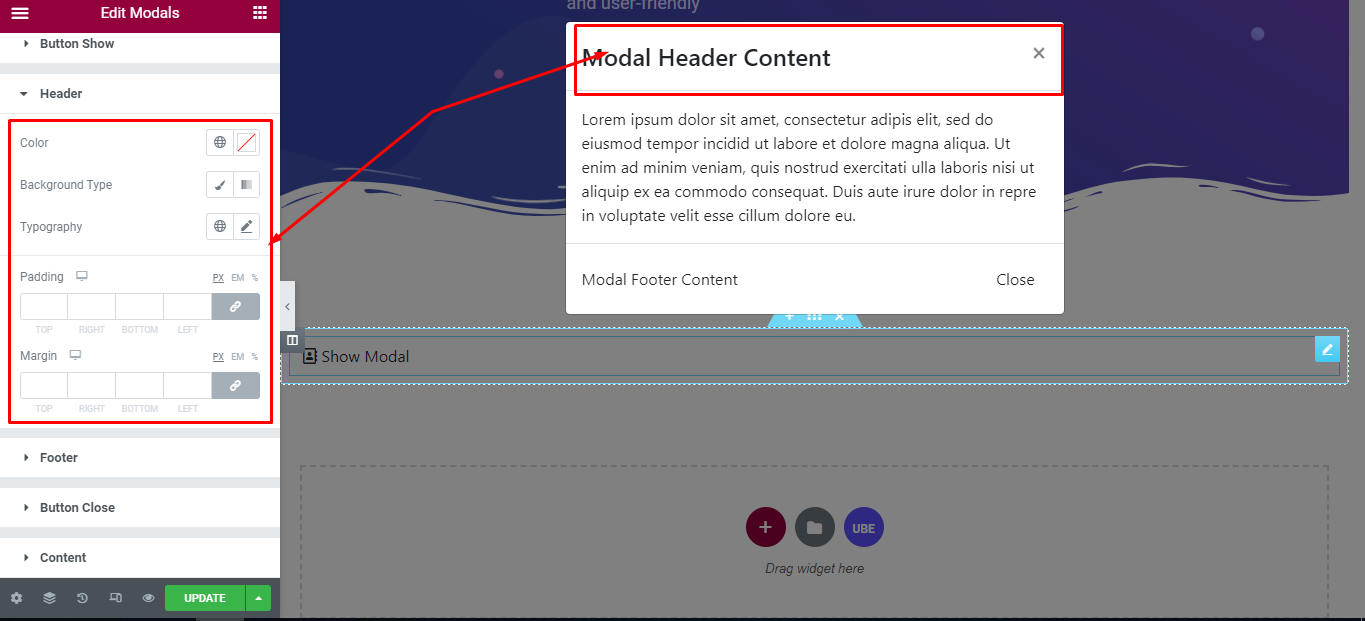
Header
‘Header’ section lets you choose Color, Typography, Background Type, Padding, Margin to the header of modals.
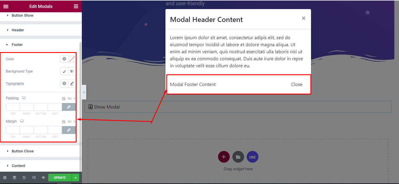
Footer
‘Footer’ section lets you choose Color, Typography, Background Type, Padding, Margin to the footer of modals.
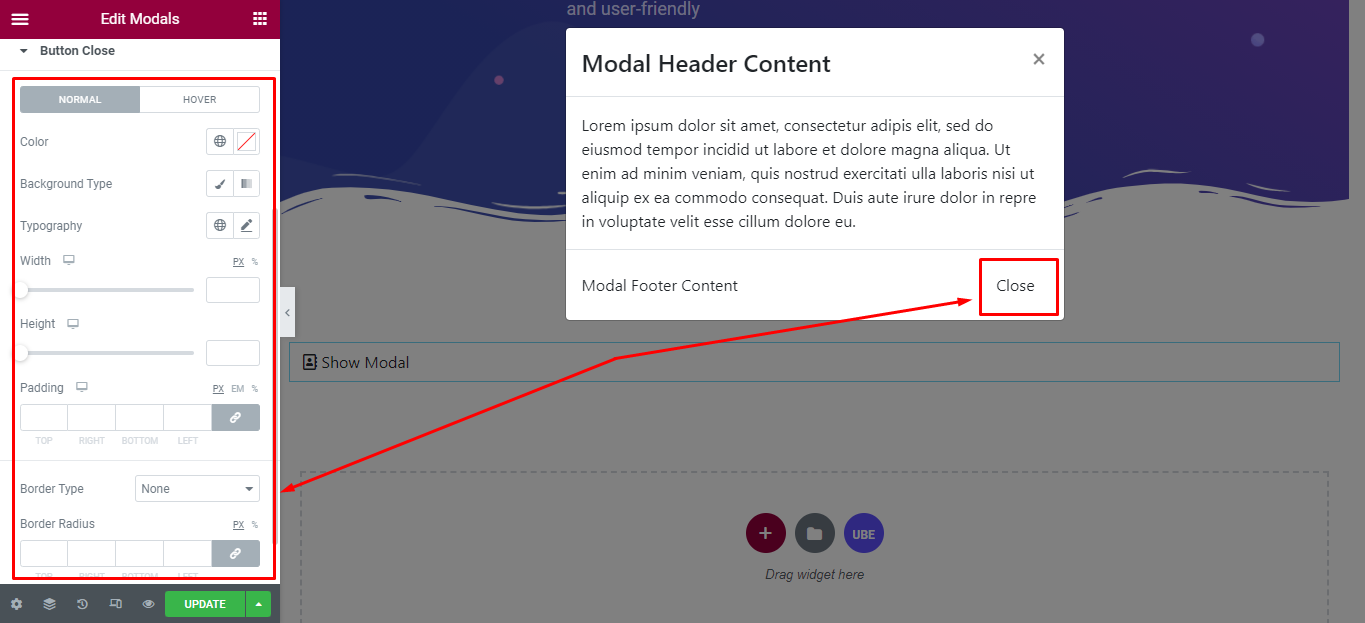
Button Close
‘Button Close’ section lets you choose Alignment, Width, Height, Border Type, Padding, Border Radius; Typography, Border Type, Background Type in normal and hover mode to the button trigger close modal of modals.
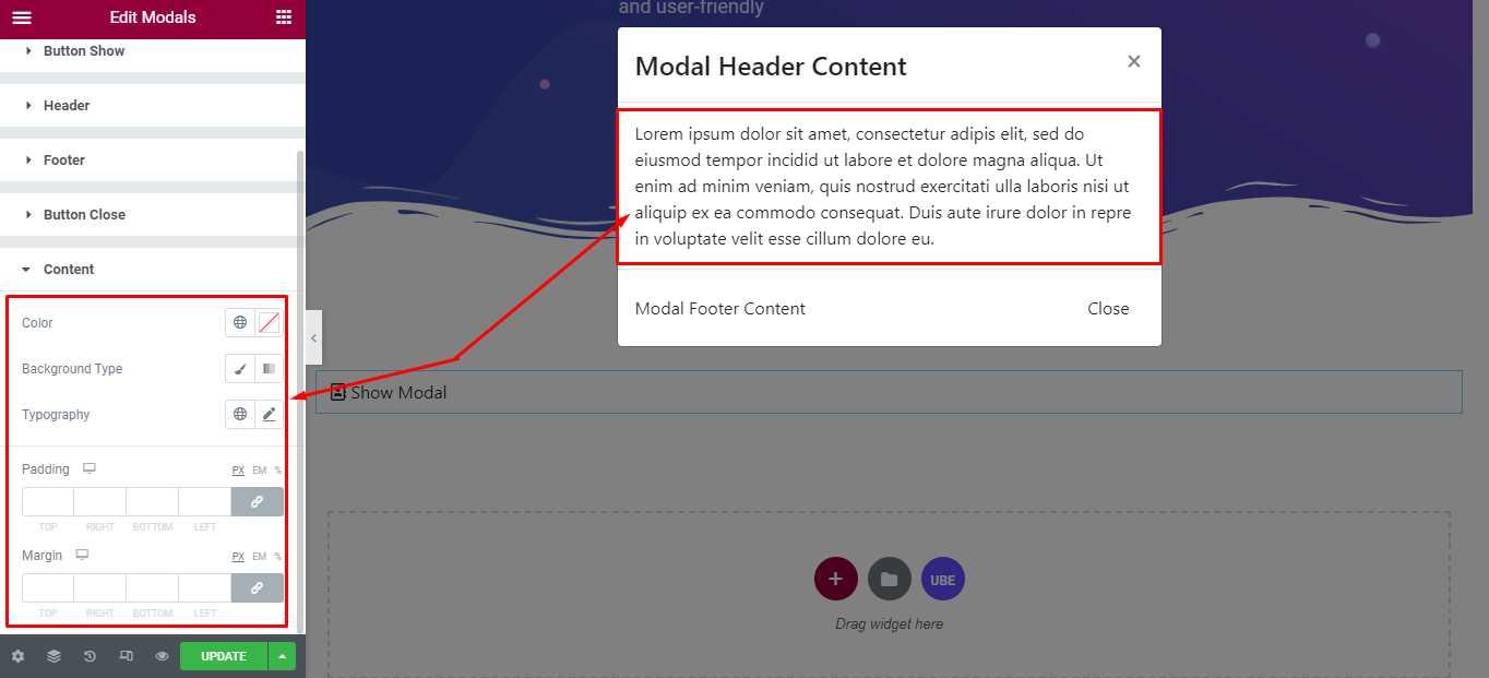
Content
‘Content’ section lets you choose Color, Typography, Background Type, Padding, Margin to the Content of modals.
Final Outcome
By following these mentioned steps and a bit more modifying & styling, you can easily design your Modals as per your preference.
By using UBE Modals, this is how you can easily put the spotlight on your significant contents & make them appealing to your visitors.
Getting stuck? Feel to Contact Our Support for further assistance.