Dropcaps
How To Use A Dropcaps Widget Of UBE Addons
Dropcaps are big letters to use as an initial letter of passages. Dropcaps are very useful to mark important paragraphs and notice the reader’s eye to that. For over two thousand years, drop caps have been used for the printed page industry.
With the Dropcaps widget, you can create a stunning first letter and customize different drop caps attributes, such as font, label, color, background color, size, border, and so on.
Using Drop Cap:
You can see the below video to get an insight into how you can use the Dropcaps Widget to create beautiful designs. Or you can follow the documentation whichever you find convenient.
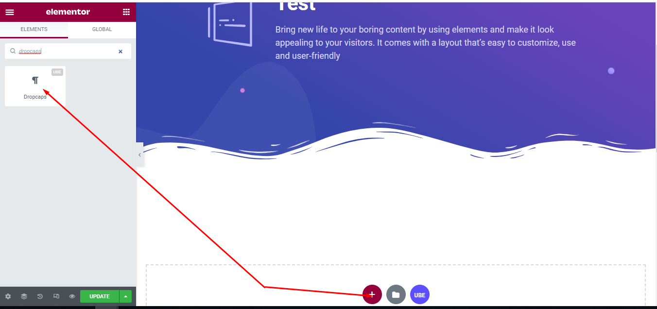
How to Activate Dropcaps
To use this UBE Addons element, find the ‘Dropcaps‘ element from the Search option under the ‘ELEMENTS‘ tab. Simply just Drag & Drop the ‘Dropcaps‘ into the ‘Drag widget here‘ or the ‘+’ section.
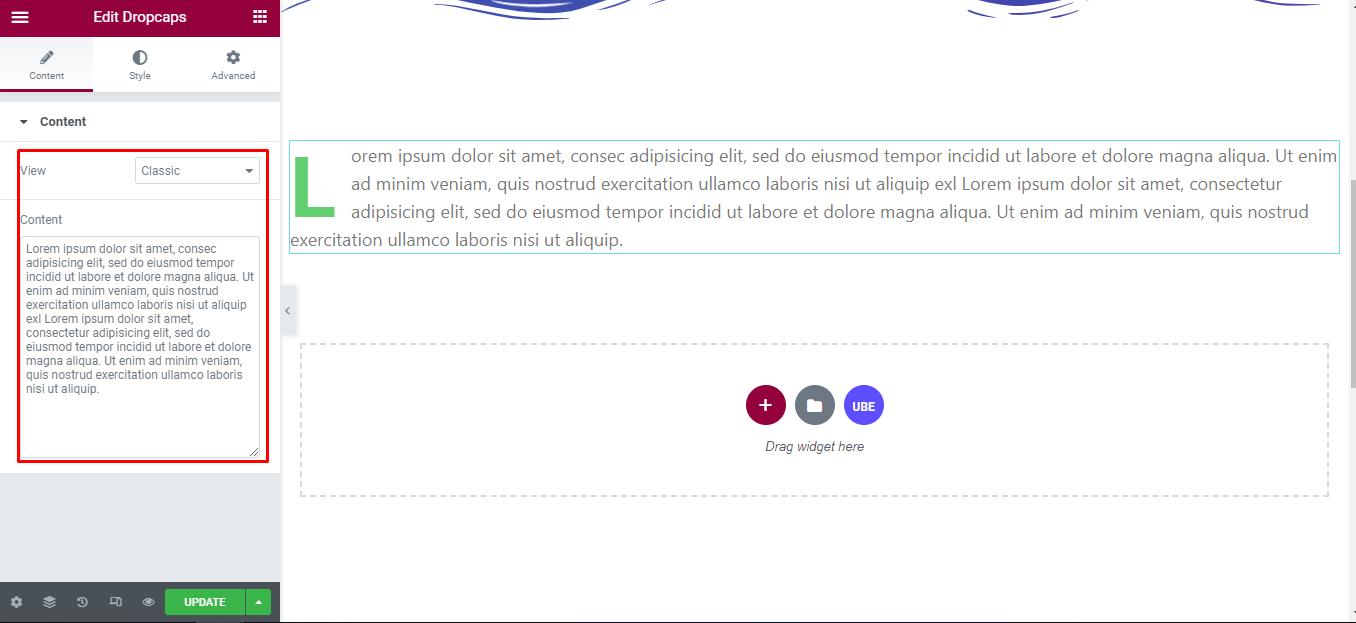
How to Configure Content Settings
Under the ‘Content’ tab, you will find the Dropcaps sections.
Content
| View | Choose the default style of dropcap |
|---|---|
| Sharp | Choose the shape of the first letter is round or square |
| Content | Enter text |
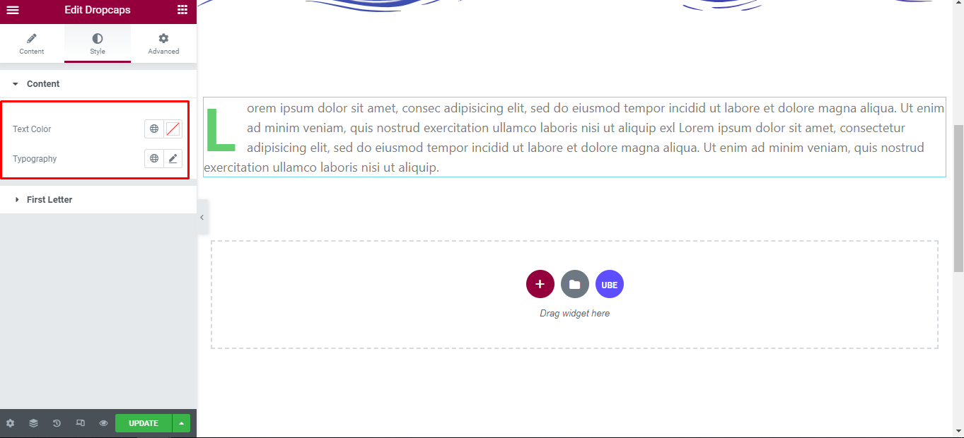
How to Style Dropcaps
Switch to the ‘Style’ tab to style all the elements of Dropcaps.
Content
‘Content’ section lets you add Typography, Text Color to the text of dropcaps.
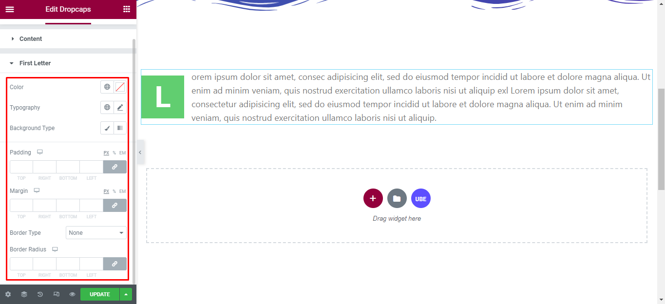
First Letter
‘First Letter’ section lets you add Typography, Color, Padding, Margin, Background Color, Border Type, Border Radius to the First Letter of dropcaps.
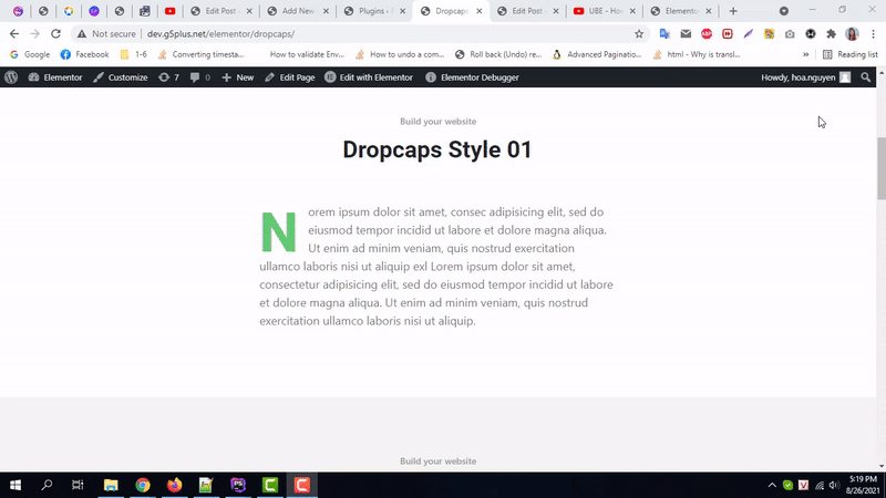
Final Outcome
By following these mentioned steps and a bit more modifying & styling, you can easily design your Dropcaps as per your preference.
By using UBE Dropcaps, this is how you can easily put the spotlight on your significant contents & make them appealing to your visitors.
Getting stuck? Feel to Contact Our Support for further assistance.