Progress Bar
How To Use A Progress Bar Widget Of UBE Addons
Progress Bar lets you easily visualize progression in specific fields with lots of layouts & styling options. With this element, you can showcase your skills or statistical information of your company in an eye-catchy manner.
Using Progress Bar:
You can see the below video to get an insight into how you can use the Progress Bar Widget to create beautiful designs. Or you can follow the documentation whichever you find convenient.
How to Activate Progress Bar
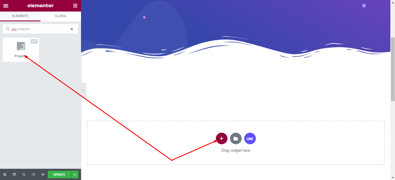
To use this UBE Addons element, find the ‘Progress Bar‘ element from the Search option under the ‘ELEMENTS‘ tab. Simply just Drag & Drop the ‘UBE Progress‘ into the ‘Drag widget here‘ or the ‘+’ section.
How to Configure Content Settings
Under the ‘Content’ tab, you will find the Progress Bar sections.
Progress
| Style | Choose the default style of progress |
|---|---|
| Alignment | Alignment for the value and label of the progress bar in case Style is Style 02 and Style 04 |
| Type | Select the type of progress |
| Color | Select the available color according to the color of the bootstrap |
| Display Value | Allow display value or not |
You can add the number of progress bars you want by clicking the “+ Add Item” button, each item includes:
| Label | Enter the label of the progress bar |
|---|---|
| Value | The value of the progress bar, the maximum is 100 |
| Speed (milliseconds) | Enter the speed of the animation, the unit is milliseconds |
| Custom Color | Allow custom color or not |
| Color | Choose the color of the value |
| Background Color | Choose background color of the value |
| Fill Color | Choose the background color of the value range |
| Background Color | Choose background color of the value |
| Arrows Color | Choose background color of the arrow |

How to Style Progress Bar
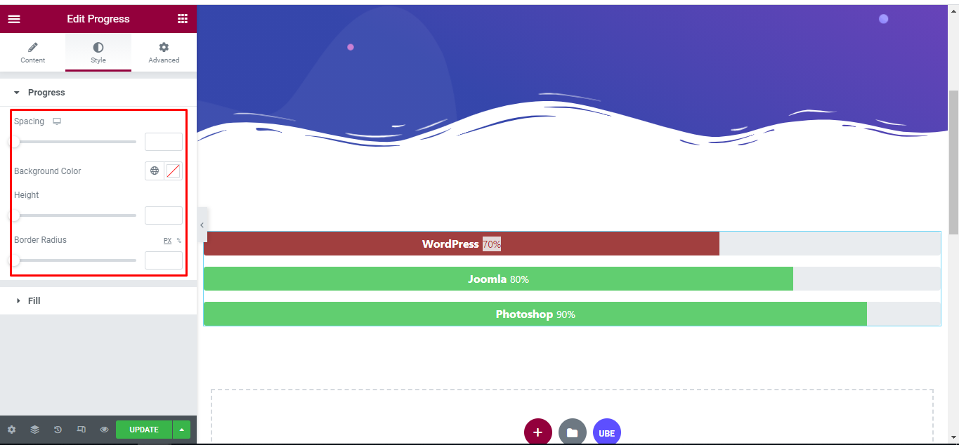
Switch to the ‘Style’ tab to style all the elements of Progress Bar.
Progress
‘Progress’ section lets you add Spacing, Background Color, Height, Border Radius to the text of Progress.
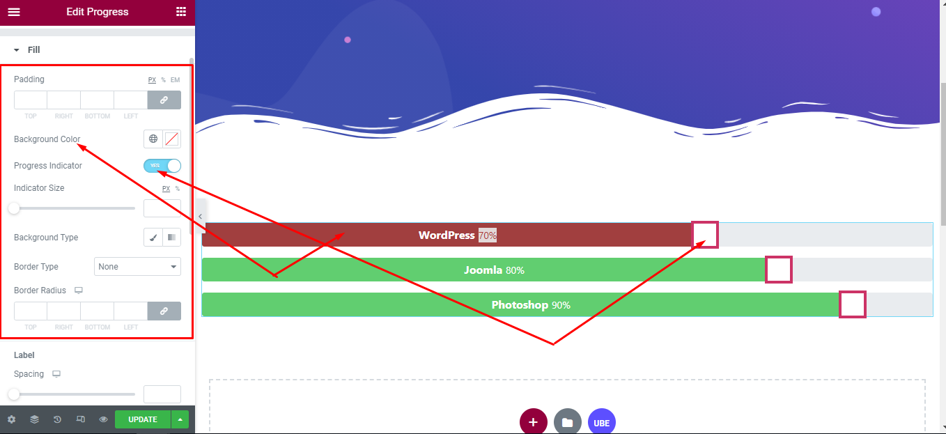
Fill
‘Fill’ section lets you add Padding and Background Color to Progress, Indicator Size, Background Type, Border Type, Border Radius to the Indicator of Progress.
‘Label’ section lets you add Spacing, Typography, Color to the Label of Progress.
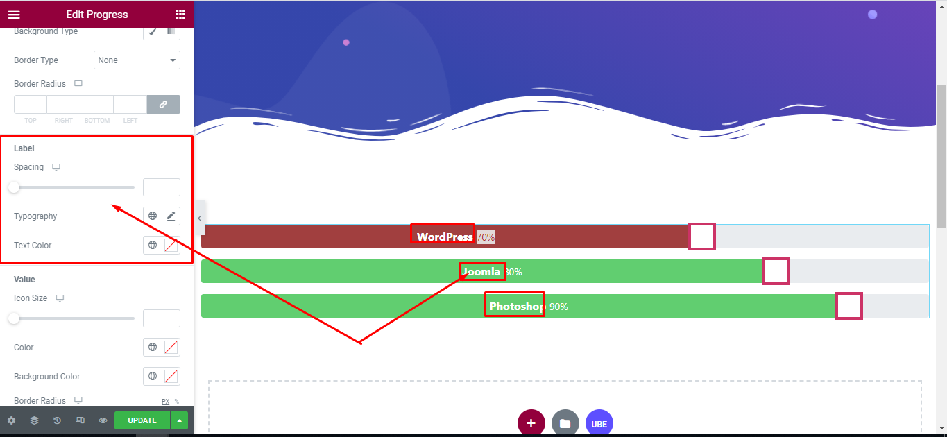
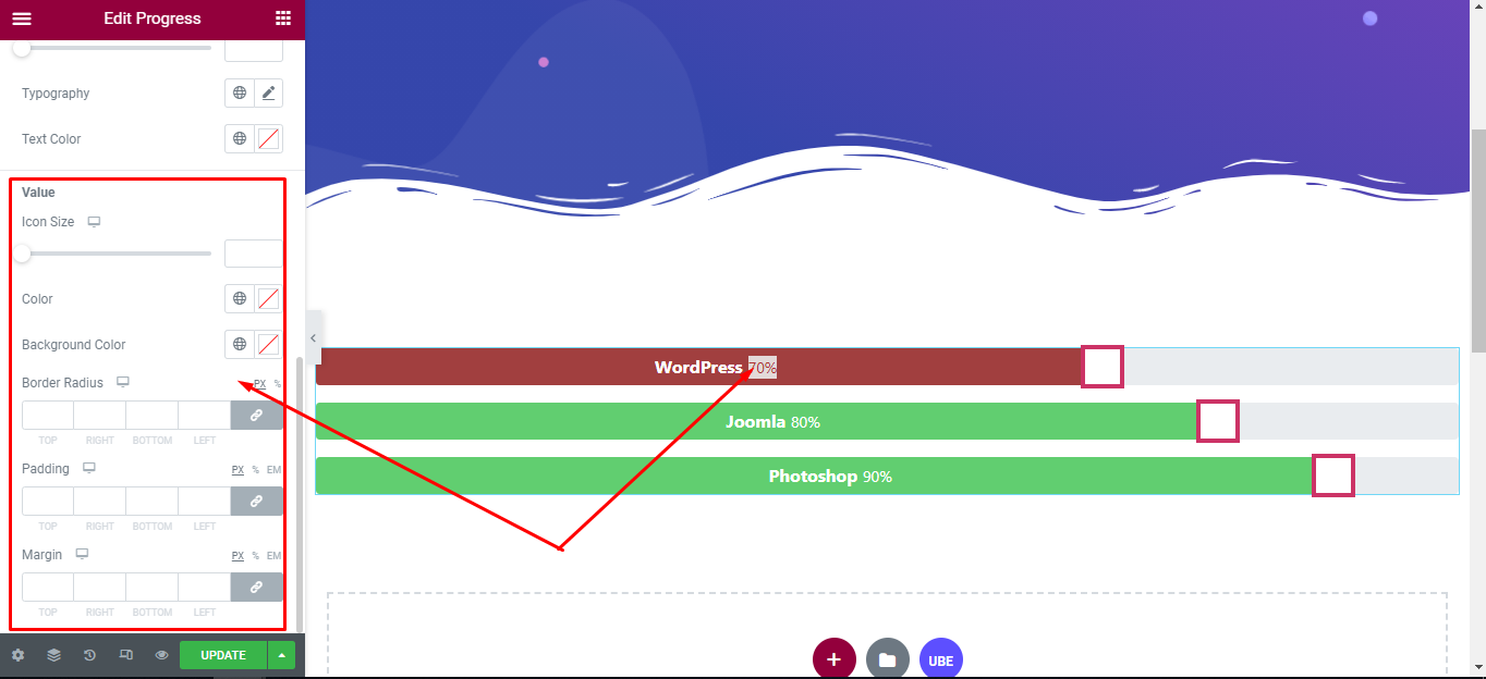
‘Value’ section lets you add Icon Size, Color, Background Color, Border Radius, Padding, Margin to the Value of Progress.
Final Outcome
By following these mentioned steps and a bit more modifying & styling, you can easily design your Progress Bar as per your preference.
By using UBE Progress Bar, this is how you can easily put the spotlight on your significant contents & make them appealing to your visitors.
Getting stuck? Feel to Contact Our Support for further assistance.